The BrewHouse is a cozy, neighborhood café nestled in the heart of Boston, Massachusetts. Specializing in imported coffees and artisanal teas, they curate the perfect blend to complement a selection of freshly baked goods. Whether you're grabbing a quick espresso or enjoying a leisurely tea break, The BrewHouse offers a warm, inviting atmosphere for all.

Project Overview
The Product:
The BrewHouse, a popular café franchise based in Boston, MA, is launching a comprehensive digital initiative to enhance customer engagement and streamline its services. The project involves the development of two key digital platforms:
A user-friendly mobile app will enable easy order placement for pickup or delivery, with features like menu browsing, customization, secure payments, and loyalty rewards.
A responsive website will serve as an informational hub, showcasing The BrewHouse’s locations, menu, and events, while capturing the café’s unique ambiance and community feel.
This dual-platform project aims to strengthen The BrewHouse’s online presence, enhance customer satisfaction, and support long-term growth in an increasingly digital market.
User Research
Gathered insights into user behaviors, needs, and pain points through interviews, surveys, and observations to inform design decisions.
Wireframing
Created low-fidelity layouts to map out core structures and user flows before visual design.
Prototyping
Built interactive mockups to simulate user interactions and test functionality before development.
Information Architecture
Organized content and navigation in a clear, logical structure to support intuitive user experiences.
Visual Design
Developed polished, brand-aligned UI elements including typography, color schemes, and layout for a cohesive look and feel.
Usability Testing
Conducted tests with users to evaluate design effectiveness and identify areas for improvement.
Accessibility Awareness
Ensured designs were inclusive and compliant with accessibility standards (e.g., WCAG), enhancing usability for all users.
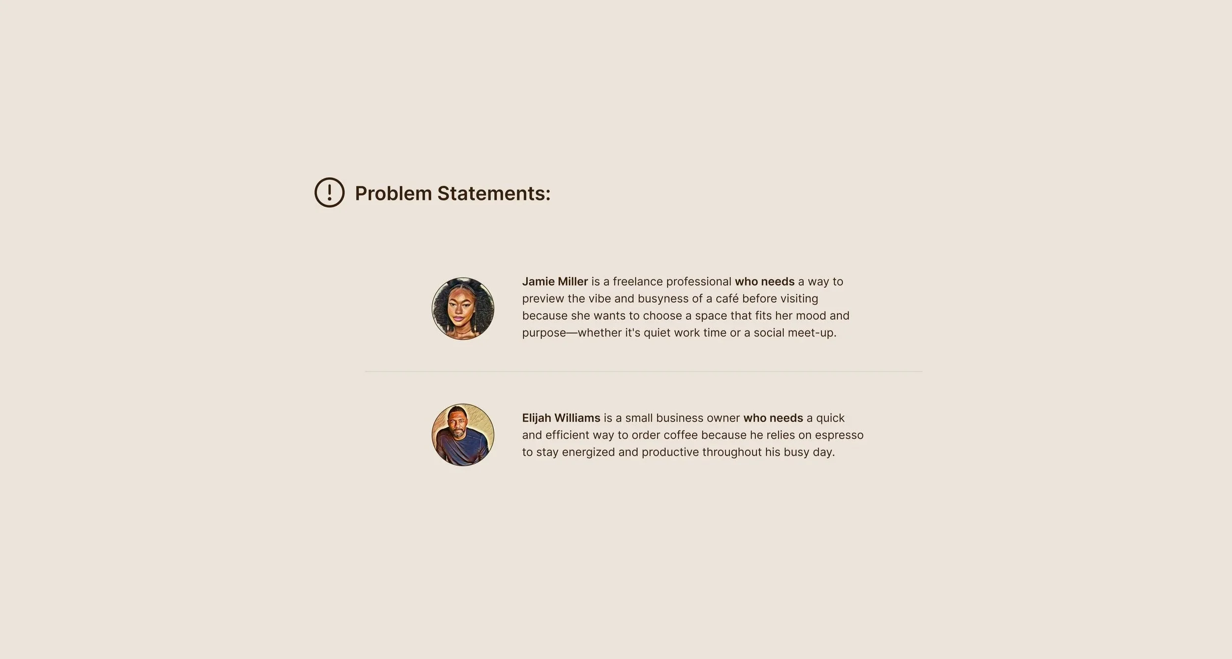
As The BrewHouse expands its café franchise across Boston, it lacks a cohesive digital platform to meet the growing demand for convenient ordering and strong online engagement. Customers face limited access to information, inconsistent ordering experiences, and no streamlined way to connect with the brand beyond physical locations, which impacts customer satisfaction and potential revenue.
To develop a seamless mobile ordering app and an engaging, brand-aligned website that together enhance customer convenience, promote The BrewHouse’s identity, and establish a strong digital presence to support long-term growth and customer loyalty.
Timeline
14 weeks
Tools
Figma
Photoshop
Role
UX/UI designer
Researcher
Key Responsibilities:
The Challenge:
The Goal:
Design Process
Emphasize
Define
Ideate
Prototype
Test
Cafe Industry and Culture
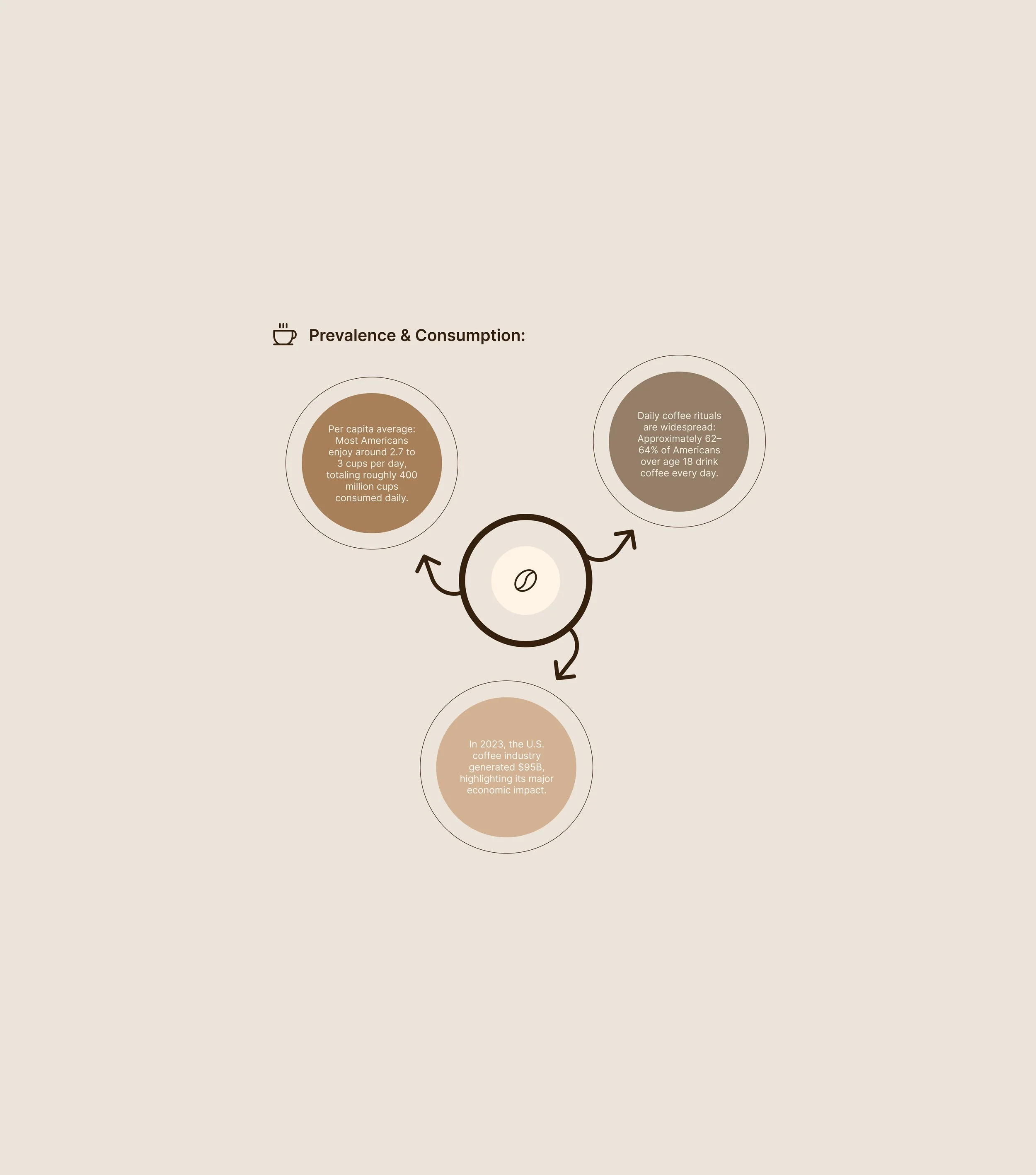
Prevalence and Consumption
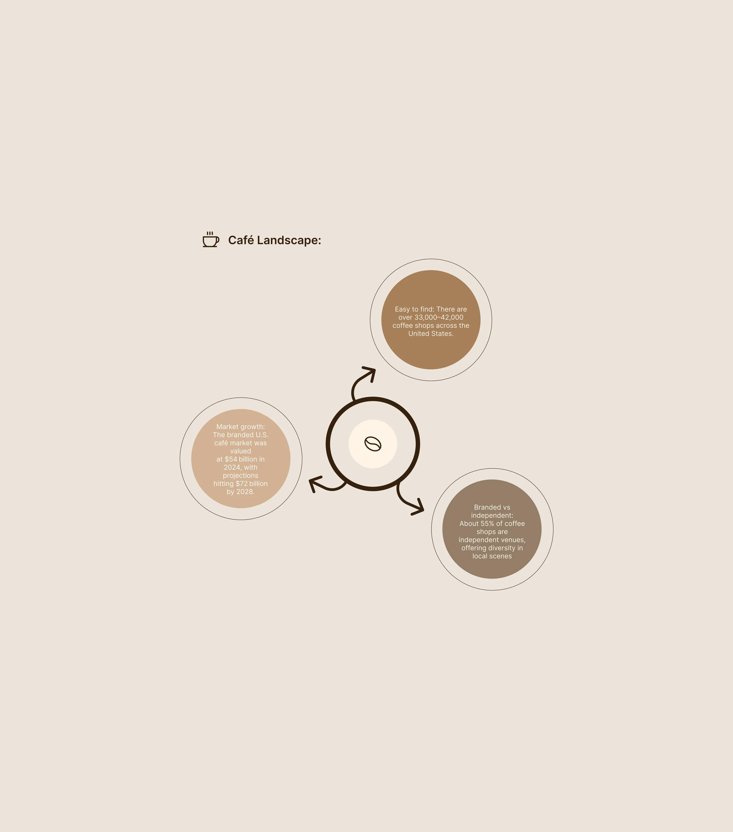
Cafe Landscape
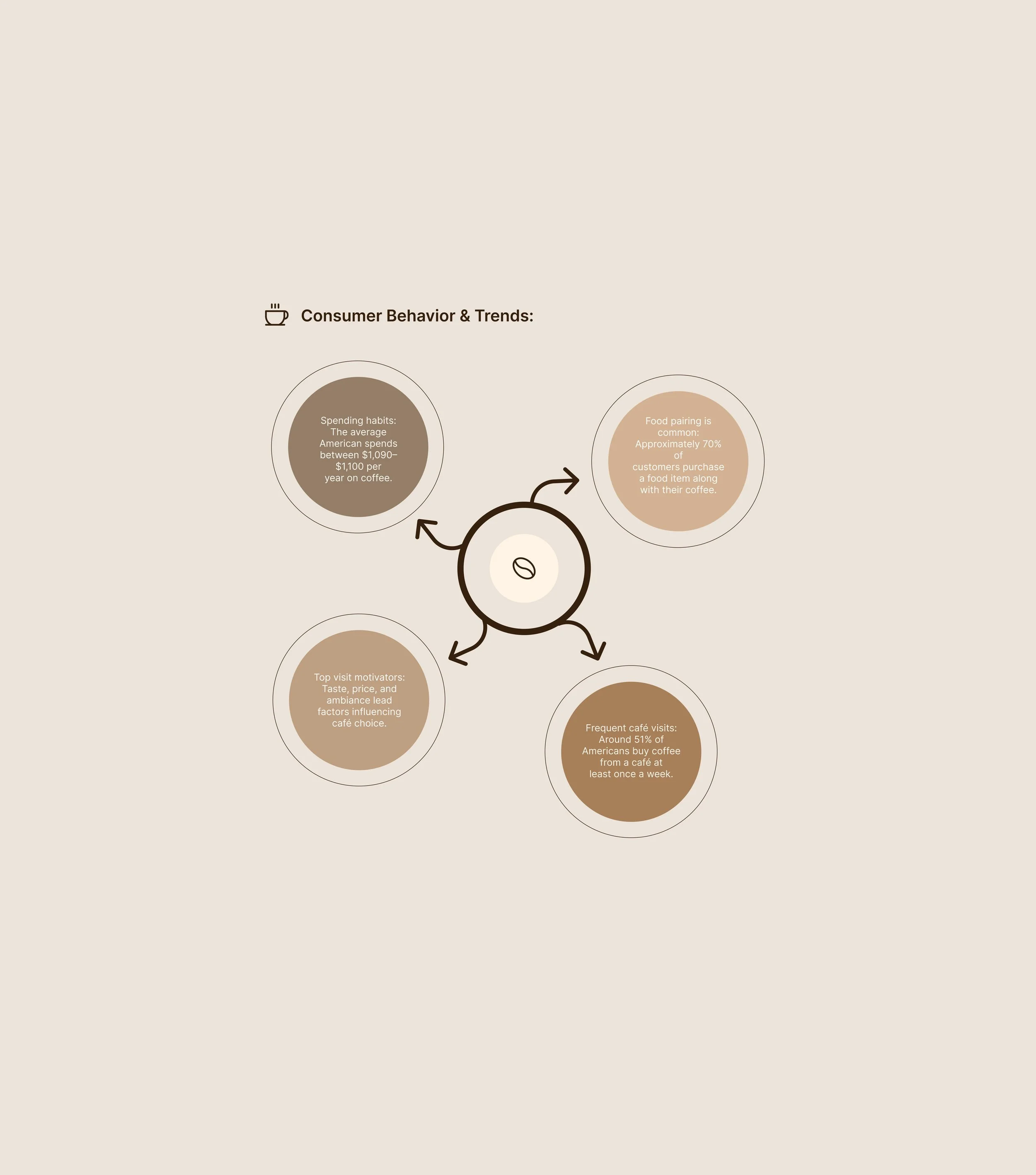
Consumer Behavior & Trends
Competitive Analysis
Market Research
Café Industry and Culture:
The café industry has grown into more than just a space for coffee—it's become a cultural hub that blends convenience, community, and creativity. Cafés today serve as informal workspaces, social meeting spots, and places of personal retreat.
With the rise of specialty coffee and a growing emphasis on experience, atmosphere, and authenticity, modern café culture values not just quality beverages but also design, ambiance, and connection.
As consumer expectations shift toward convenience and personalization, digital tools like mobile ordering and online engagement have become essential parts of the café experience.
Conclusion:
The U.S. café industry continues to thrive, driven by deeply ingrained daily coffee rituals, with over 60% of adults consuming multiple cups a day. With an annual revenue of $95 billion and over 33,000 cafés nationwide—more than half of which are independent—the landscape is both expansive and diverse.
Consumer behavior reinforces this growth, as millions of Americans visit cafés weekly, often pairing their coffee with food and prioritizing taste, price, and ambiance. As market projections rise and customer expectations evolve, the café sector remains a vital, culturally embedded part of American life and economy.
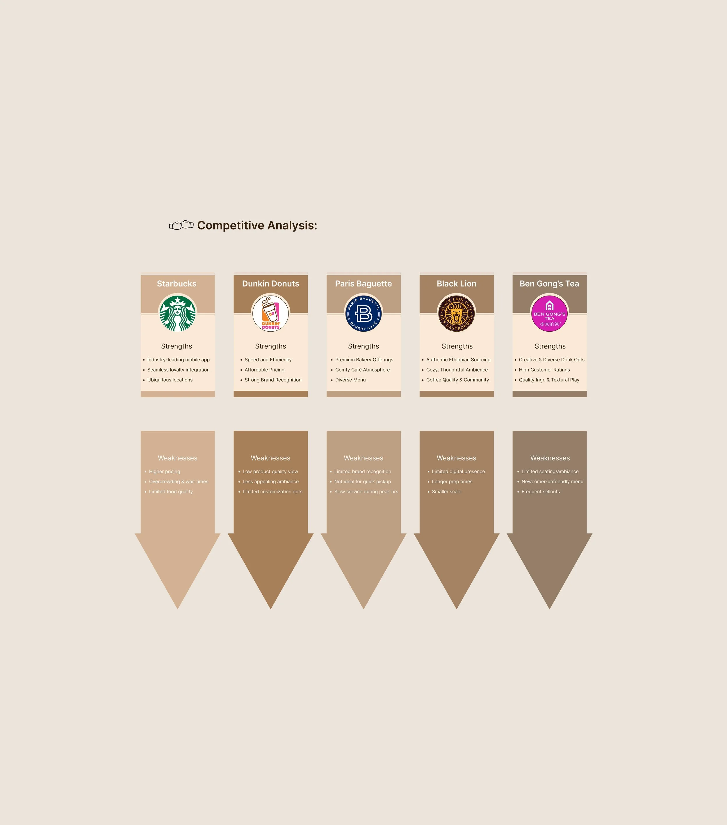
Competitive Analysis Findings:
The competitive analysis explored five key players in the café industry—Starbucks, Dunkin’, Paris Baguette, Black Lion Café, and Ben Gong’s Tea—to evaluate their positioning across branding, customer experience, product offerings, and digital presence. Each brand's core strengths, weaknesses, and opportunities were identified to understand how they engage with consumers and differentiate themselves in a competitive market.
Starbucks excels in brand reach and app convenience but lacks a local feel.
Dunkin’ offers speed and affordability, yet suffers from inconsistent quality and ambiance.
Paris Baguette stands out with premium bakery items and café vibes but needs stronger tech integration.
Black Lion Café, a local gem, shines in authenticity and community charm, though limited in digital tools.
Ben Gong’s Tea attracts with bold drink innovation but faces challenges with menu complexity and seating.
This analysis highlights clear opportunities for differentiation—particularly in ambiance, digital experience, and cultural connection—that can guide strategic design and business decisions for The BrewHouse or similar café ventures.
Understanding the User
User Research
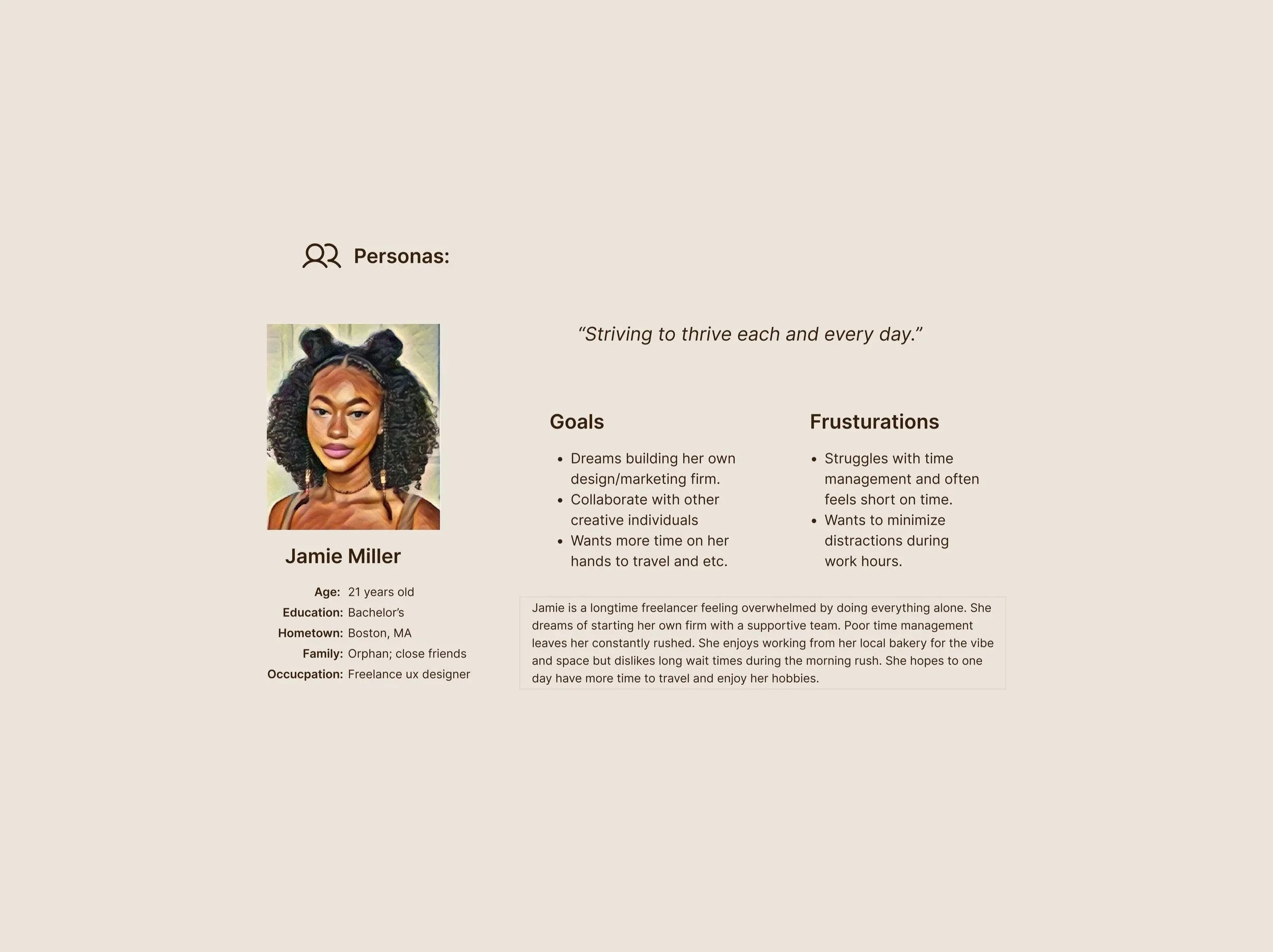
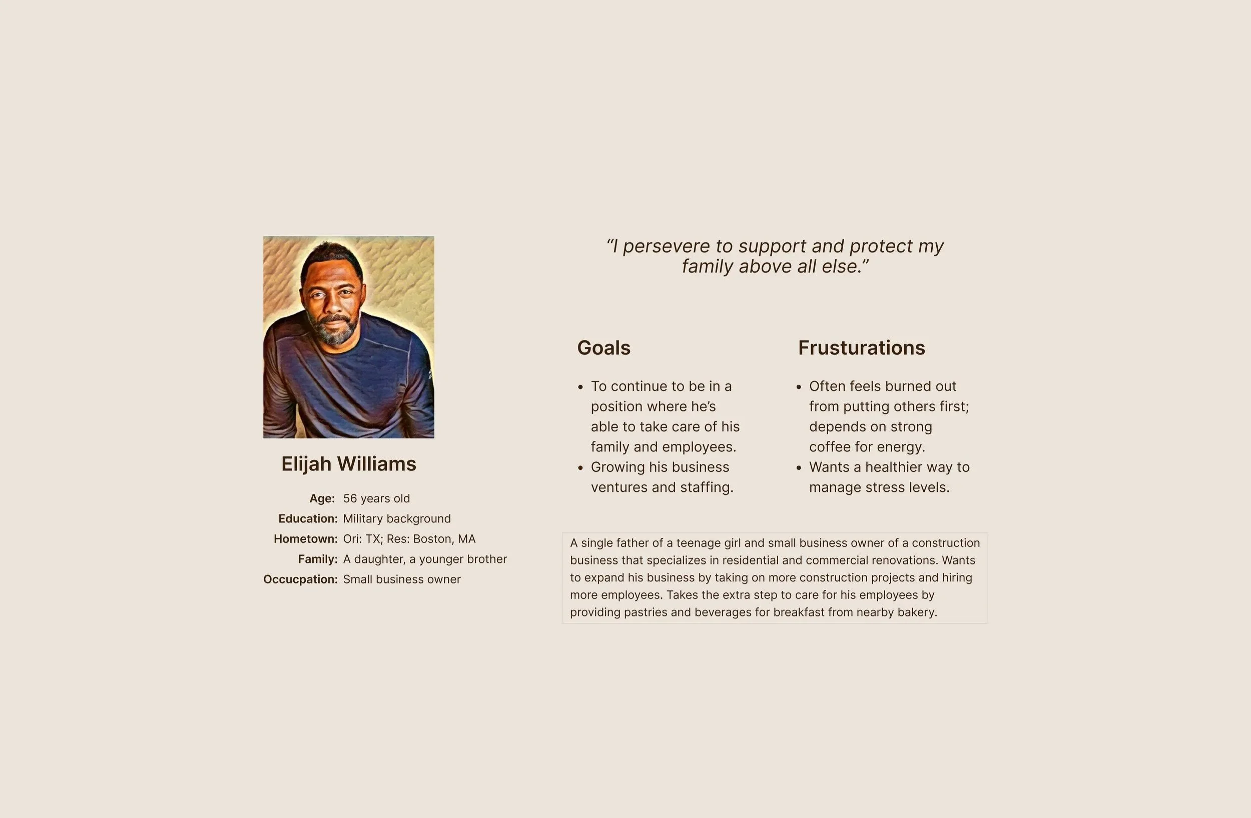
Affinity Map
Personas
Problem statements
User journey maps
User Research
Summary:
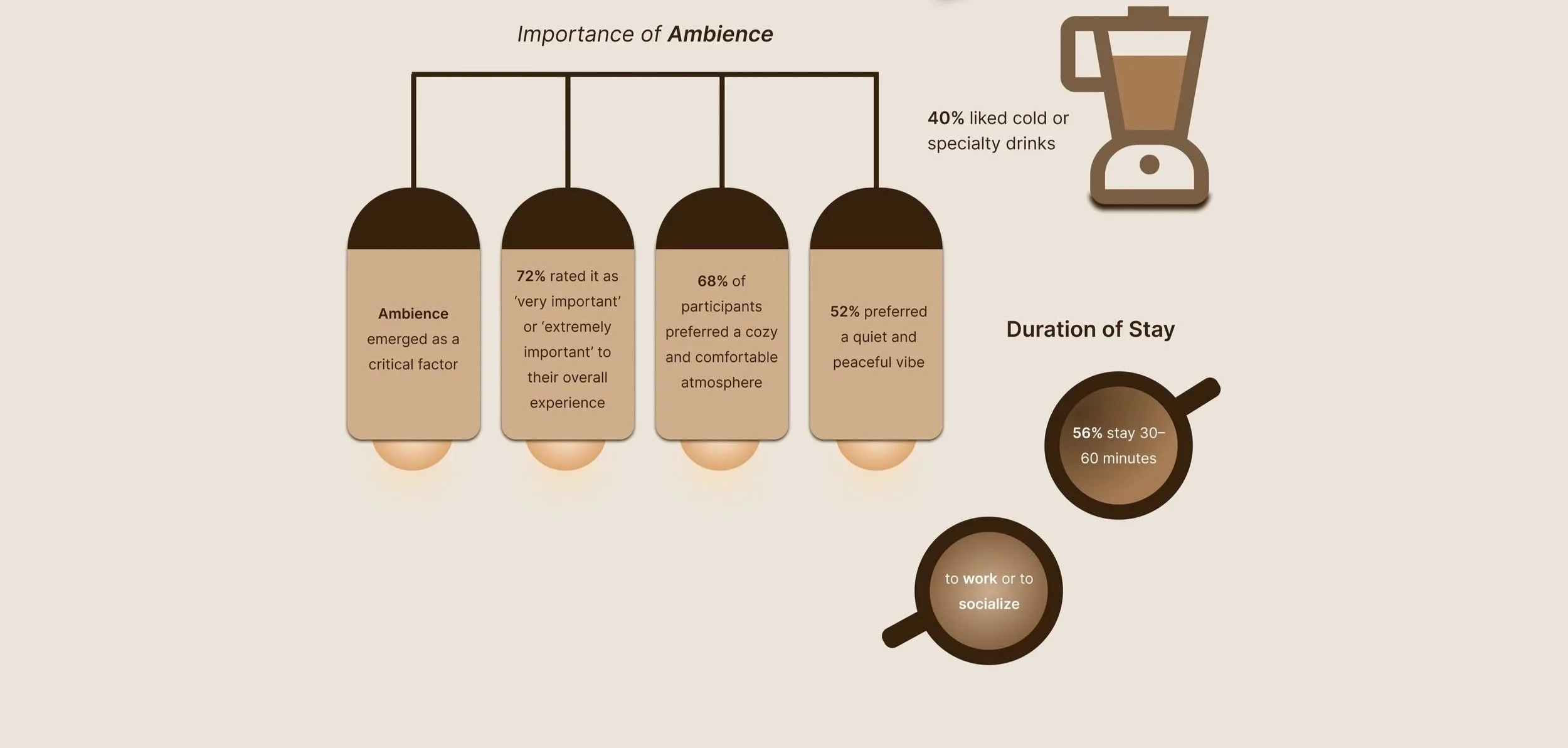
Survey and interview responses revealed customer priorities across both the in-café and digital experiences.
On the café side, participants regularly consume coffee or tea and often visit cafés to relax, socialize, or work, typically staying 30 minutes to an hour. While drink quality is important, ambience — including comfort, vibe, and layout — plays a major role in their decision to visit.
For the digital experience, users valued features like mobile ordering, loyalty rewards, and easy customization. Frustrations with existing apps included cluttered interfaces, too many steps, and lack of personalization. Some still preferred in-person ordering for more social or spontaneous visits.
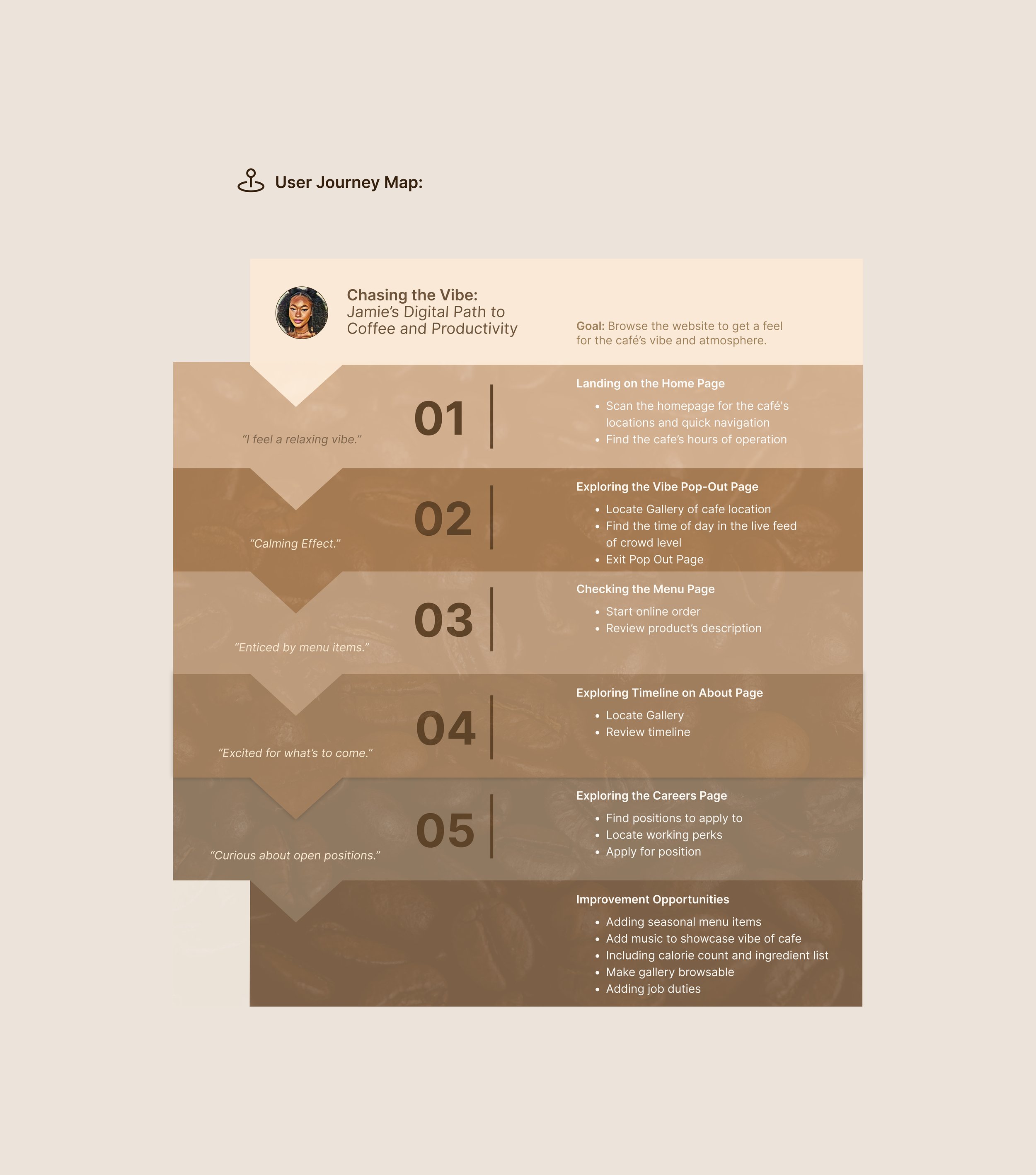
Participants also wanted clear product info, seasonal menu highlights, and a way to preview the café’s atmosphere beforehand. Many showed interest in learning about The BrewHouse’s story through a visual timeline.
These findings guided the mobile app and website design, focusing on intuitive navigation, immersive content, and visually engaging elements that balance convenience with storytelling.
User Surveys:
As part of my initial user research, I conducted a survey and interviews with individuals who had not yet visited the café, in order to gather insights into customer expectations for both the in-person experience and the café’s digital touchpoints.
I collected responses from 25 participants, representing a diverse mix of café-goers — from daily visitors to occasional customers — to better understand their preferences around drinks, ambience, visit habits, and app usage.
The research revealed that while drink quality is important, many customers place strong value on a café’s atmosphere, often using it as a space to relax, socialize, or work. On the digital side, participants expressed interest in features like mobile ordering, loyalty rewards, and customization, while also highlighting the need for clear product information, seasonal menu visibility, and a preview of the café’s vibe before visiting.
These insights helped shape both the physical and digital design approach, balancing convenience, clarity, and storytelling. My key discoveries and insights from this survey are detailed below.

User Interviews:
After completing the initial survey, which gathered insights from 25 participants about their café preferences and mobile app expectations, I moved into the next phase of my research by conducting in-depth interviews with 5 selected participants. I selected these individuals based on their availability and willingness to participate, while still aiming to capture a range of perspectives from the survey group.
Each interview lasted between 25 to 35 minutes, allowing time to explore the motivations, needs, and frustrations behind their choices — especially regarding drink preferences, desired ambience, and digital experiences.
Can you tell me more about what typically motivates your visit? “I usually go to cafés when I want a change of environment from working at home.”
What makes a great coffee or drink experience for you? “I usually go to cafés when I want a change of environment from working at home.”
Are there specific elements that make a space feel comfortable or inviting? “I usually go to cafés when I want a change of environment from working at home.”
Are there any experiences with other café or food apps that you really liked and/or disliked? “Ordering ahead is huge for me — especially when I’m on the go.”
How do you see the café’s physical space and mobile app working together to improve your experience? “I think it’d be cool to see real photos of the space before I go — like a preview of the vibe.”
Key Themes from Participant Interviews
These interviews helped me validate key survey findings while uncovering deeper insights to guide more user-centered design decisions.
Participants emphasized that cafés serve as more than just a stop for drinks — they are valued as comfortable, flexible spaces for working, relaxing, or socializing. Ambience elements like cozy seating, lighting, and noise levels were consistently mentioned as essential to a positive in-café experience.
On the digital side, interviewees reinforced the importance of mobile app features like order-ahead functionality, loyalty rewards, and the ability to save favorite customizations, all of which support speed and convenience.
A recurring theme was the desire for a strong connection between the app and the physical space, such as previewing the café’s vibe or knowing peak hours. These insights will directly inform design choices that prioritize both practical utility and emotional engagement, helping create a café experience that aligns with users' lifestyles and expectations.
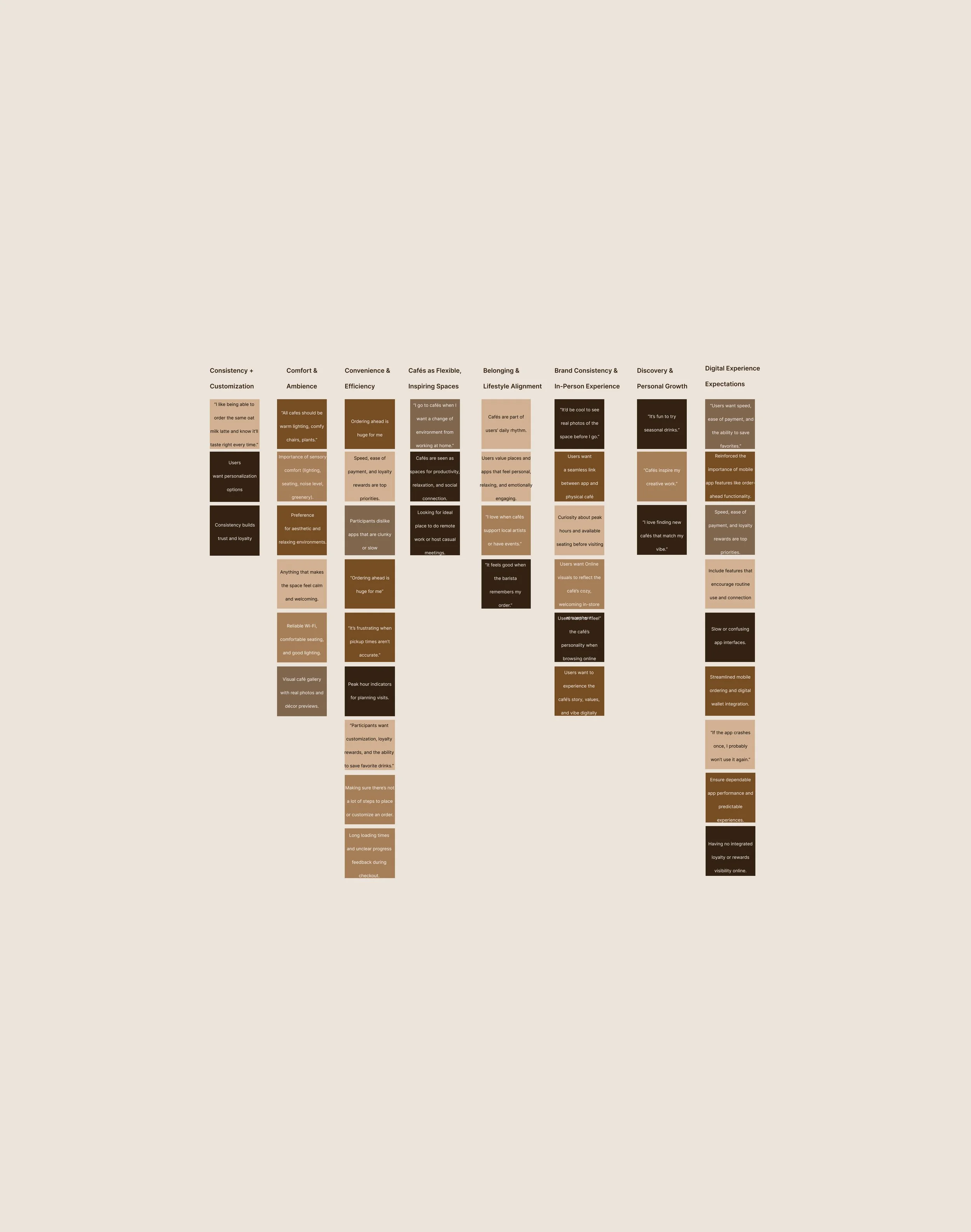
Affinity Map:
Pain Points:
Cumbersome Ordering Process
Users find the current ordering process slow and unintuitive, with too many steps to complete a simple order, especially on mobile.
Difficulty Finding Seasonal Items
New or limited-time menu items (e.g. fall drinks) are often buried or not clearly promoted, making them easy to miss.
No Preview of Café Atmosphere
Customers want to preview the ambiance, but the digital experience doesn’t offer visuals of individual locations.
Disconnected Brand Experience Online
The digital platforms lack the warm, community vibe of the cafés, weakening the brand’s emotional connection online.
Starting the Design
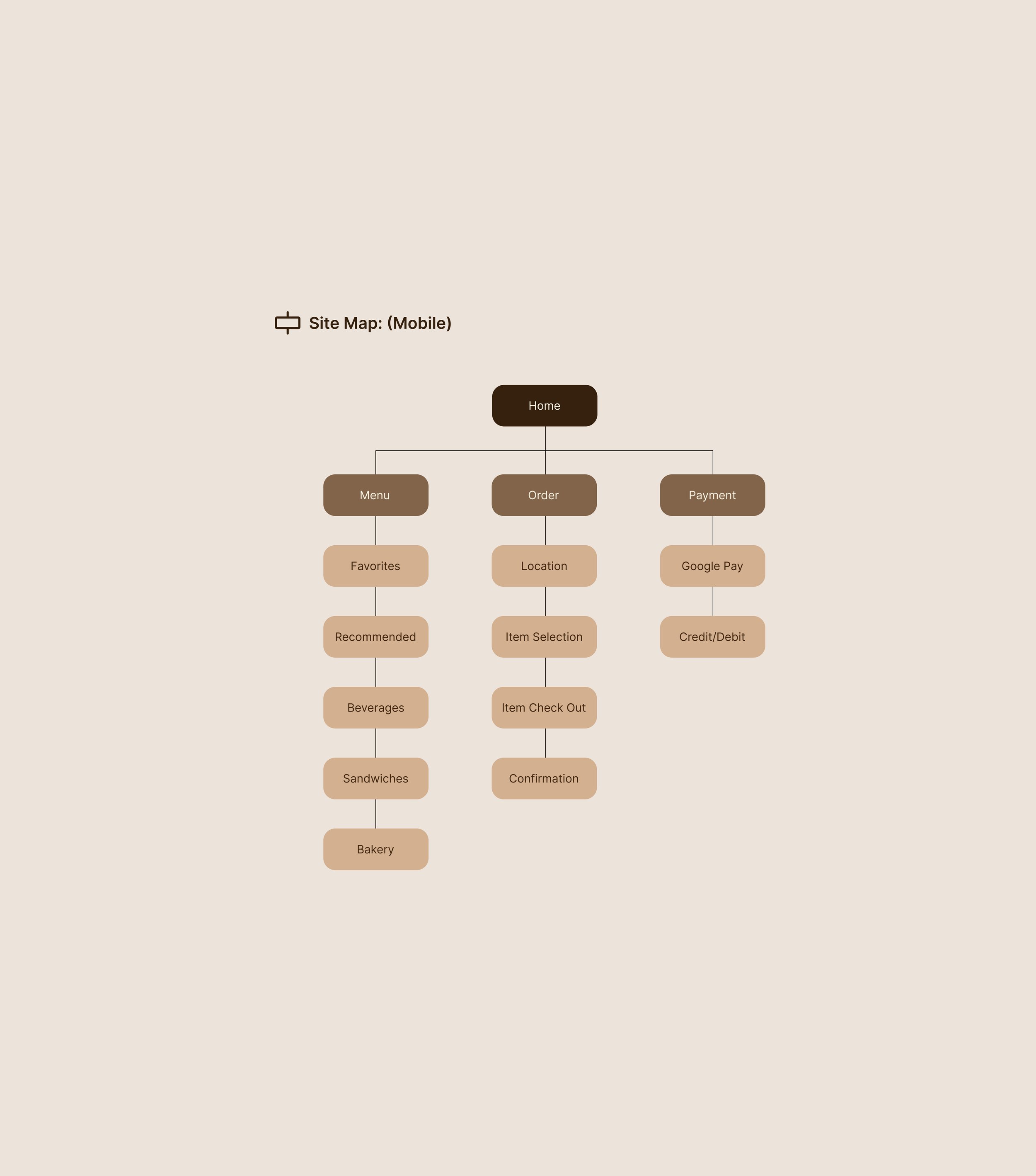
Site Map
Paper Wireframes
Digital Wireframes
Low-Fidelity Prototype
Usability Studies
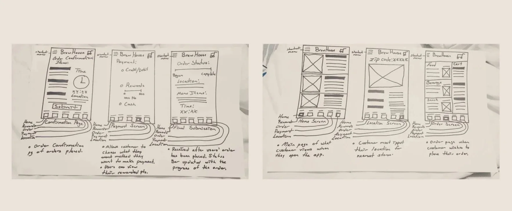
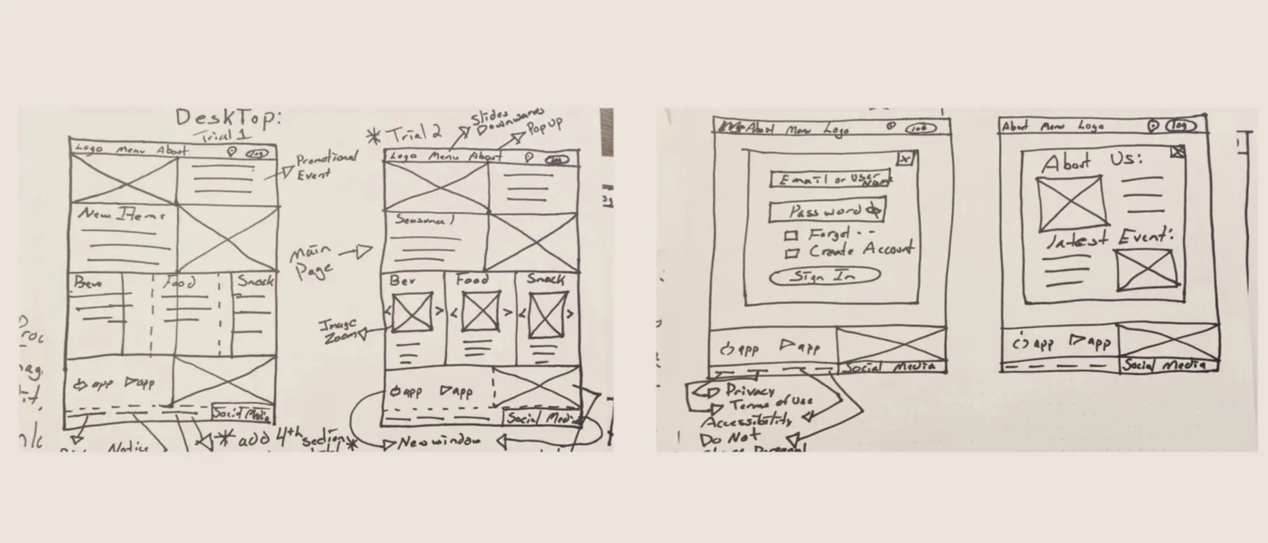
Paper Wireframes:
I sketched paper wireframes to establish a clear, intuitive layout that prioritized essential info like the menu and location, while subtly reflecting the café’s unique vibe and story.
Paper wireframes allowed me to rapidly test different information hierarchies and ensure the interface balanced utility with personality before moving into digital prototypes.
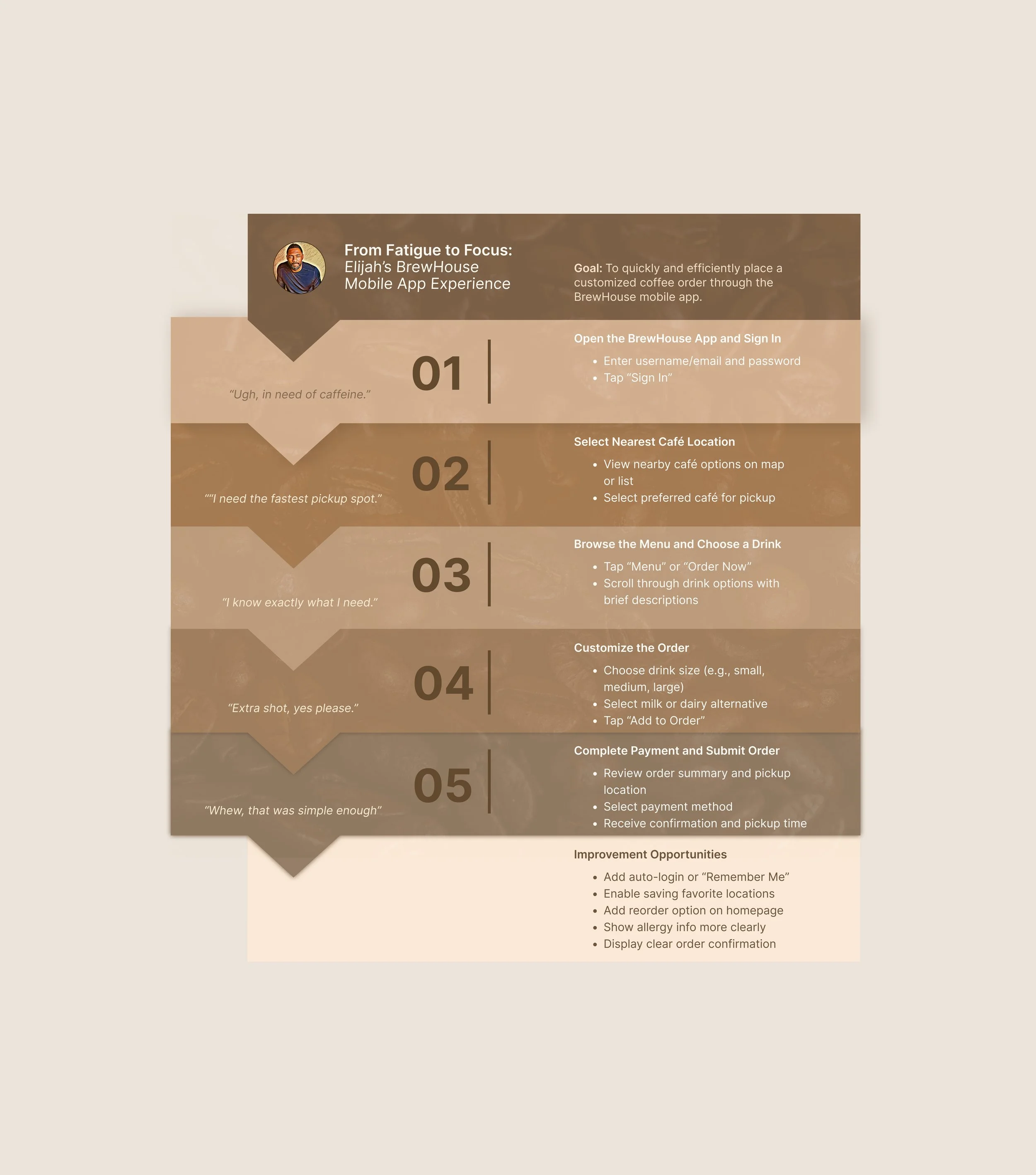
The mobile app was designed with a focus on functionality—streamlining the ordering process for quick, on-the-go access.
In contrast, the desktop website emphasizes storytelling and key information, offering users a richer experience of the café’s vibe, history, location, and hours. Each platform was tailored to meet user needs based on context and intent.
Mobile
Desktop

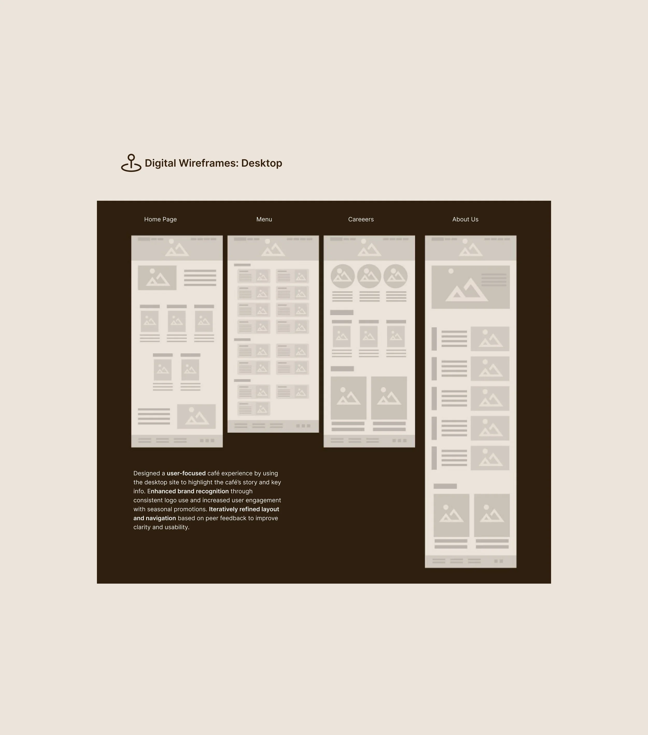
Digital Wireframes: Purpose
Focused the mobile design on quick, functional ordering with a streamlined layout, while the desktop site emphasized storytelling and key café info.
Peer feedback led to simplifying navigation, enhancing visual hierarchy, and making key actions and branding more visible—resulting in a more intuitive, engaging user experience across both platforms.
Low Fidelity Wireframes:
I created a low-fidelity prototypes to explore layout and user flow, with the desktop version designed to satisfy customer curiosity through storytelling and content exploration, while the mobile version focused on a streamlined, functional experience for placing orders quickly and efficiently.


Usability Study: Parameters
Before finalizing the café’s mobile and desktop ordering experiences, I conducted a usability study to better understand how users interact with each platform and where improvements could be made.
My goal was to identify pain points, gather feedback on navigation, content clarity, and overall usability, and uncover opportunities to make the experience more intuitive and engaging.
On mobile, I focused on streamlining the ordering flow, while on desktop, I aimed to explore how users connect with the brand story and environment.
This study helped inform design decisions that would better meet user needs and enhance both functionality and experience.
Usability Study: Mobile Findings
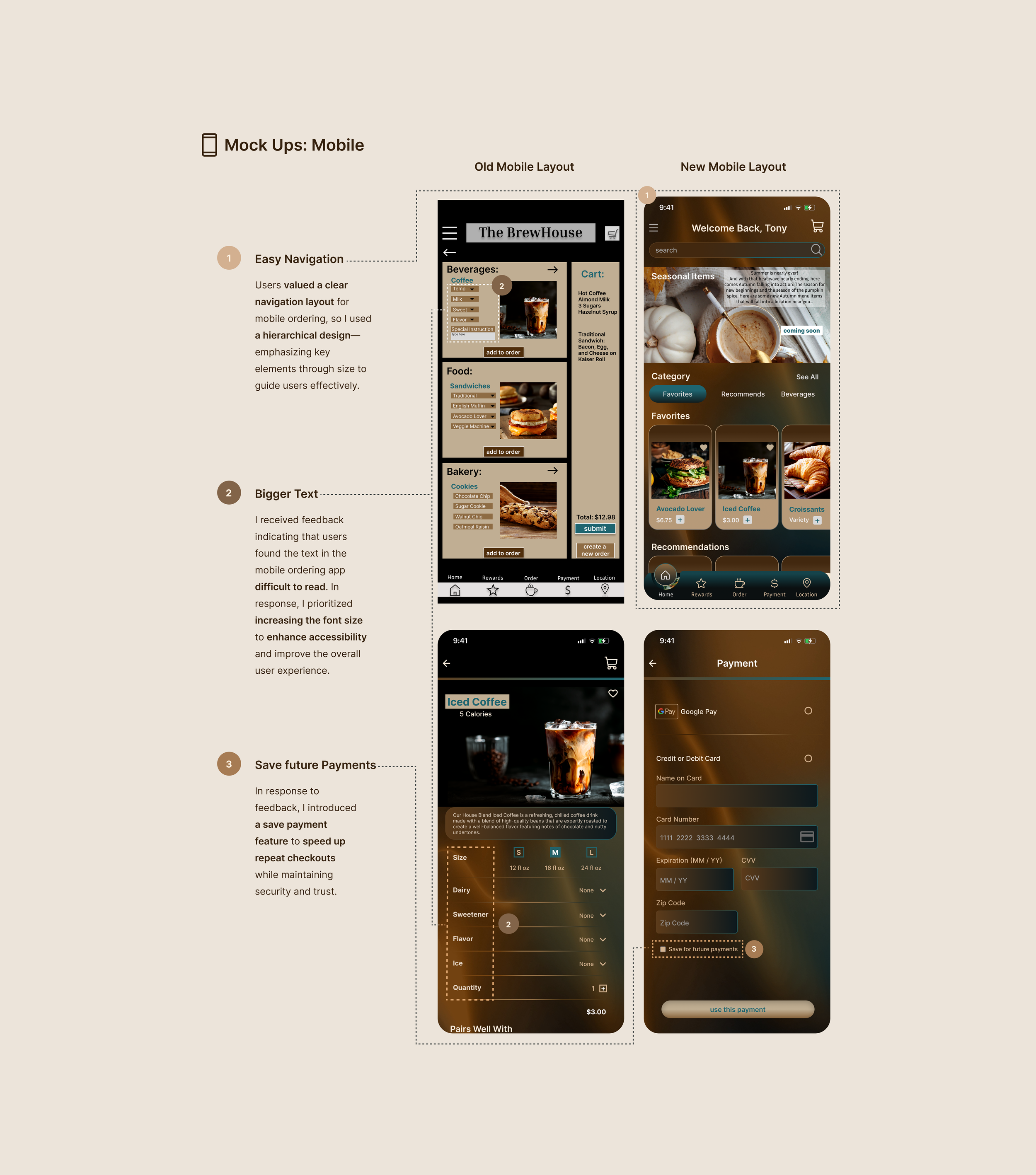
Easy Navigation
Provide more spacious and uncluttered layouts to help users navigate the mobile ordering app more easily and confidently, reducing tap errors and visual overwhelm.
Usability Study: Desktop Findings
Gallery
Users preferred a carousel-style gallery for easier navigation and more control when browsing images, allowing them to view content at their own pace without being overwhelmed.
During usability testing of the café’s mobile ordering app, I identified a few key areas for improvement based on user feedback.
Users wanted easier navigation through more spacious, uncluttered layouts, and suggested larger text to improve readability—especially when ordering on the go.
Many also requested the ability to save payment info to make future checkouts faster and more convenient. These findings helped guide design updates to create a smoother, more user-friendly experience.
Bigger Text
Increase text size throughout the mobile ordering steps to improve readability and reduce cognitive load for users, especially in fast-paced or on-the-go scenarios.
While testing the desktop experience, I uncovered several features users felt would enhance their connection to the café.
They preferred a carousel-style gallery for easier image browsing and more control over pacing.
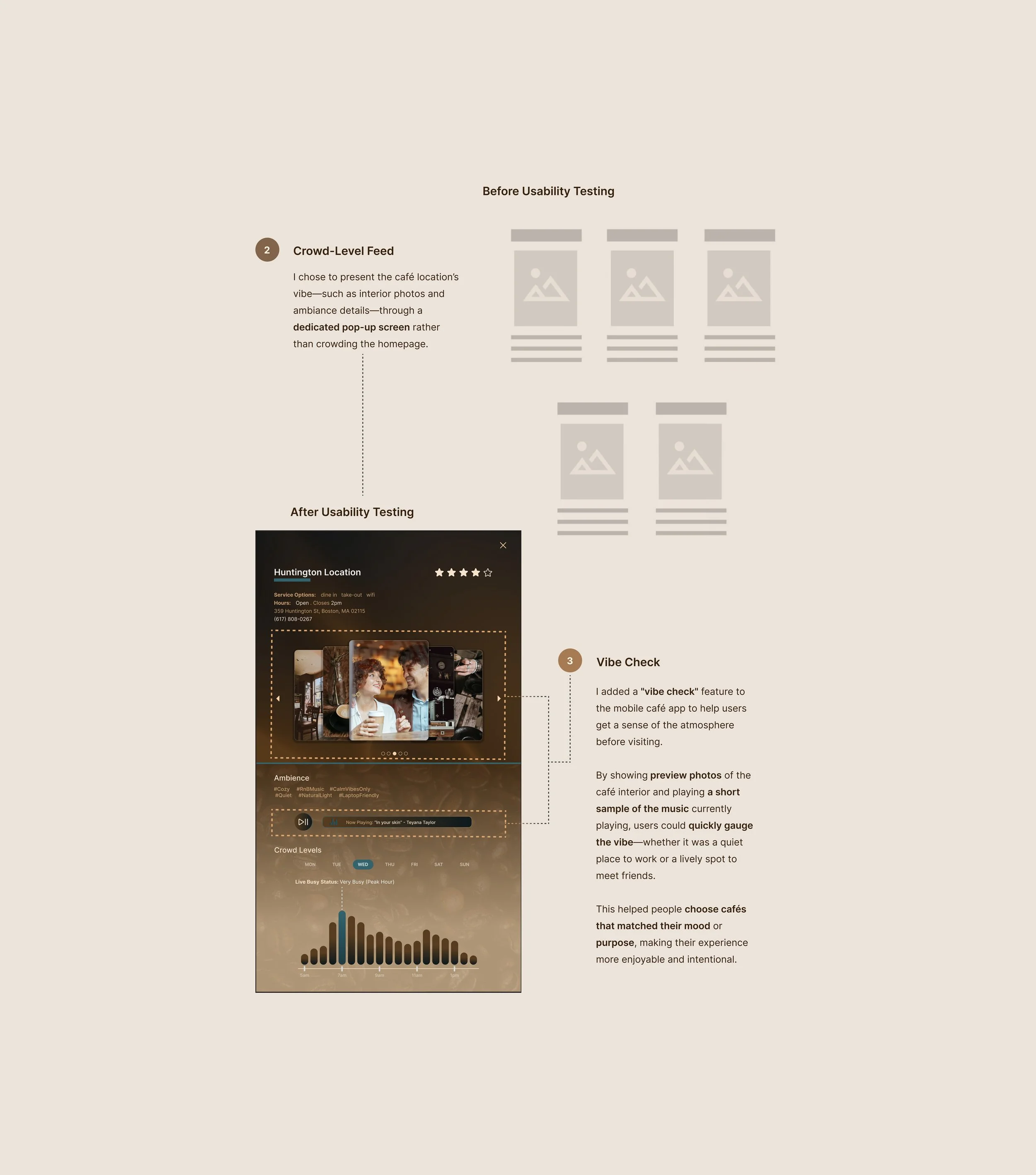
Many were also interested in a live crowd-level feed to check how busy the café is in real time, helping them plan visits more efficiently.
Lastly, users wanted a “vibe check”—a preview of the café’s atmosphere through interior photos and the current playlist—to get a feel for the space before coming in.
These insights shaped features that make the desktop experience more informative and engaging.
Crowd-Level Feed
Users expressed interest in a live crowd-level feed to help them track how busy the café is in real time, enabling better planning and avoiding peak hours.
Study Type
Unmoderated usability study
Location
United States, Remote
Participants
5 participants
Length
20-30 minutes
Save future Payments
Allow users to save payment information for future use, streamlining the checkout process and reducing friction during repeat orders.
Vibe Check
Users wanted a preview of the café’s atmosphere—including interior photos and the current playlist—to get a sense of the vibe before visiting.
Refining the Design
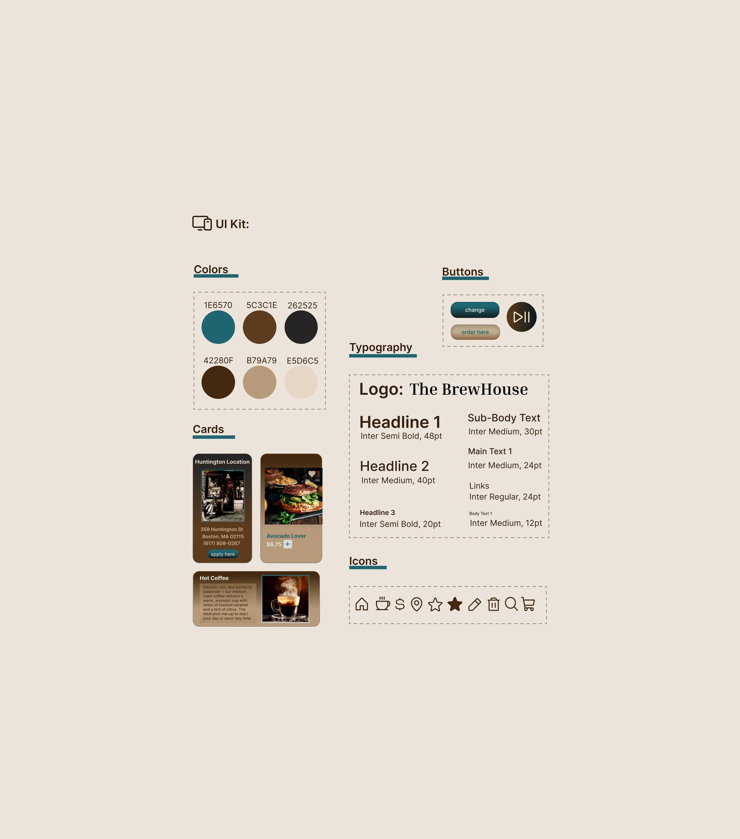
UI Kit
Mock Ups
High-Fidelity Wireframes
Accessibility


Accessibility Considerations:
Visual Hierarchy
Implemented a clear visual hierarchy by using properly structured headings with varying text sizes.
I implemented key accessibility best practices—such as a clear visual hierarchy through typographic scaling, touch-friendly and screen-reader-accessible buttons, and consistent use of descriptive alt text across all images—to enhance usability for all users.
Prioritizing accessibility is a core part of inclusive UX/UI design, ensuring equitable access, improving overall user experience, and aligning with universal design principles.
Accessible Interactions
Designed buttons to be both easily tappable on touch devices and fully accessible to screen readers.
Screen Reader Support
Ensured all images include descriptive alt text across every page to support seamless screen reader navigation.
Reflections
Take Aways
Next Steps
Take Aways: Impact
What I Learned:
Next Steps:
Follow-Up Testing
Conduct follow-up usability testing on new website
Our target users found the design intuitive to navigate, visually engaging through the use of imagery, and well-structured with a clear visual hierarchy—effectively capturing and communicating the café’s inviting vibe and atmosphere.
I gained a deeper understanding of how color choices impact user emotion and perception, reinforcing the importance of intentional visual design.
Most importantly, I learned to ground design decisions in real user needs, ensuring that every idea and solution directly supports a meaningful and effective user experience.
Reflecting on the Brewhouse project, this case study was a valuable opportunity to deepen my understanding of user-centered design.
Through the process, I learned the importance of iterative testing, accessibility, and designing with both functionality and experience in mind.
Moving forward, I plan to conduct follow-up usability testing to validate the impact of the redesign, continue identifying areas for improvement, and explore new feature ideas based on user needs.
I’m also excited to experiment with subtle animations to create a more engaging and dynamic user experience.
Overall, this project reinforced the value of empathy, continuous feedback, and thoughtful design in building digital products that truly serve their users.
Feature Ideation
Identify an additional areas of need and ideate on new features
Enhanced Interactions
Incorporate animated elements to enhance user’s experience
Let’s Connect!
Thank you for reviewing my work on the Brewhouse’s app!
If you’d like to see more, or would like to get in touch, my contact information is provided below.
Email: JasmineWray311@gmail.com
Website: JasmineWray311.com